YURI WINE BRANDING
BRANDING | PACKAGING
Product Pairing Design Campaign for “Yuri Wine”
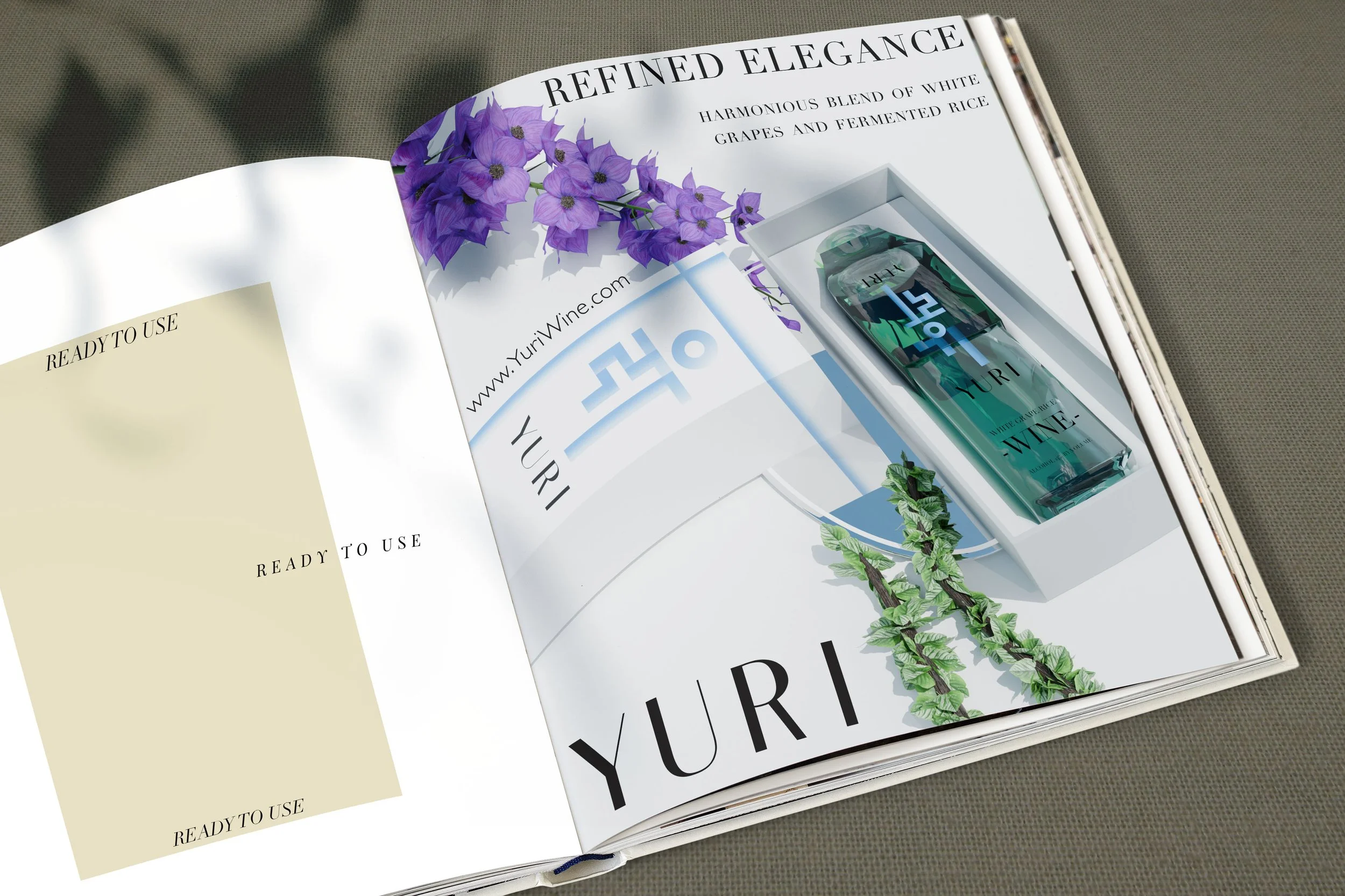
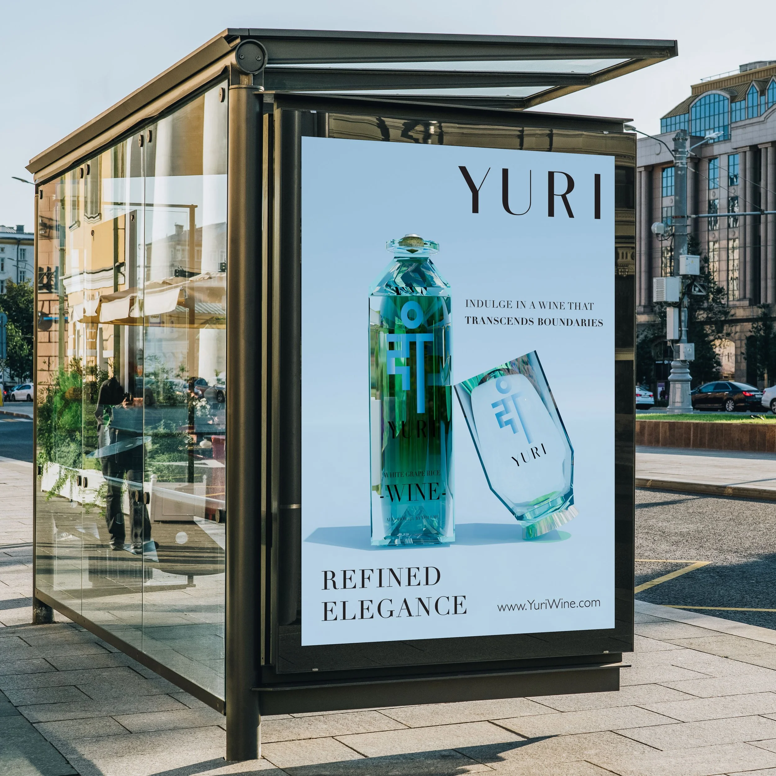
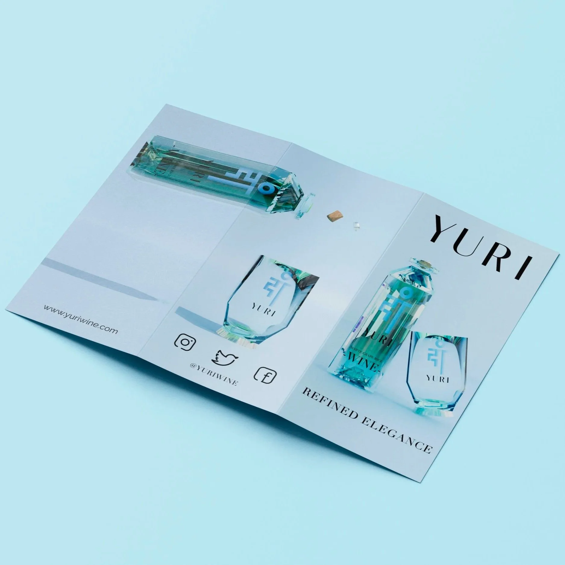
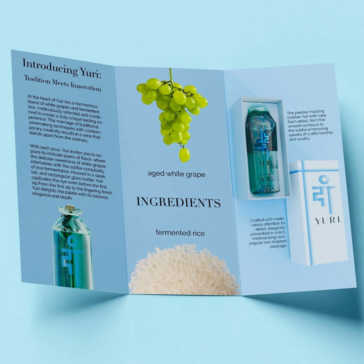
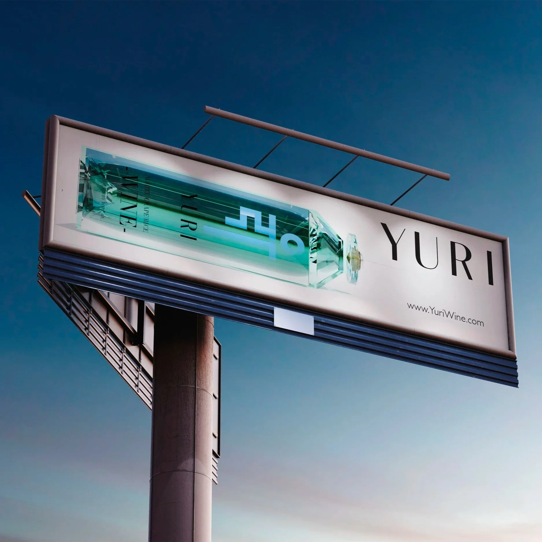
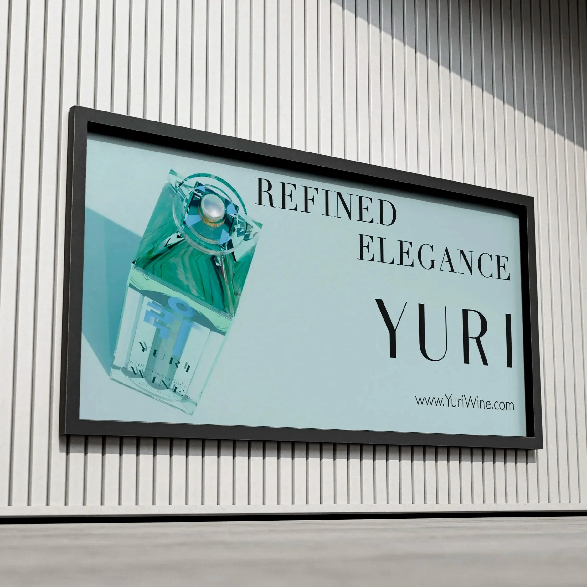
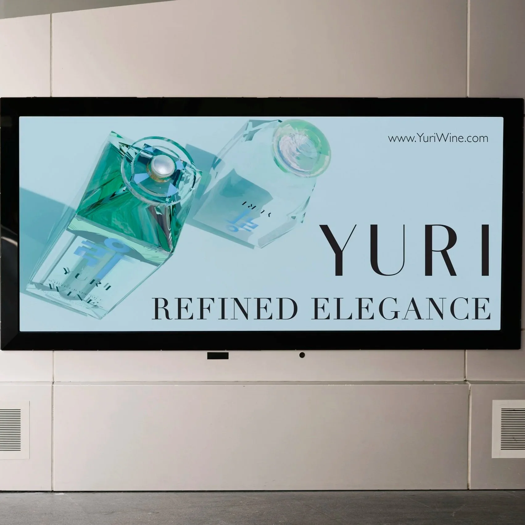
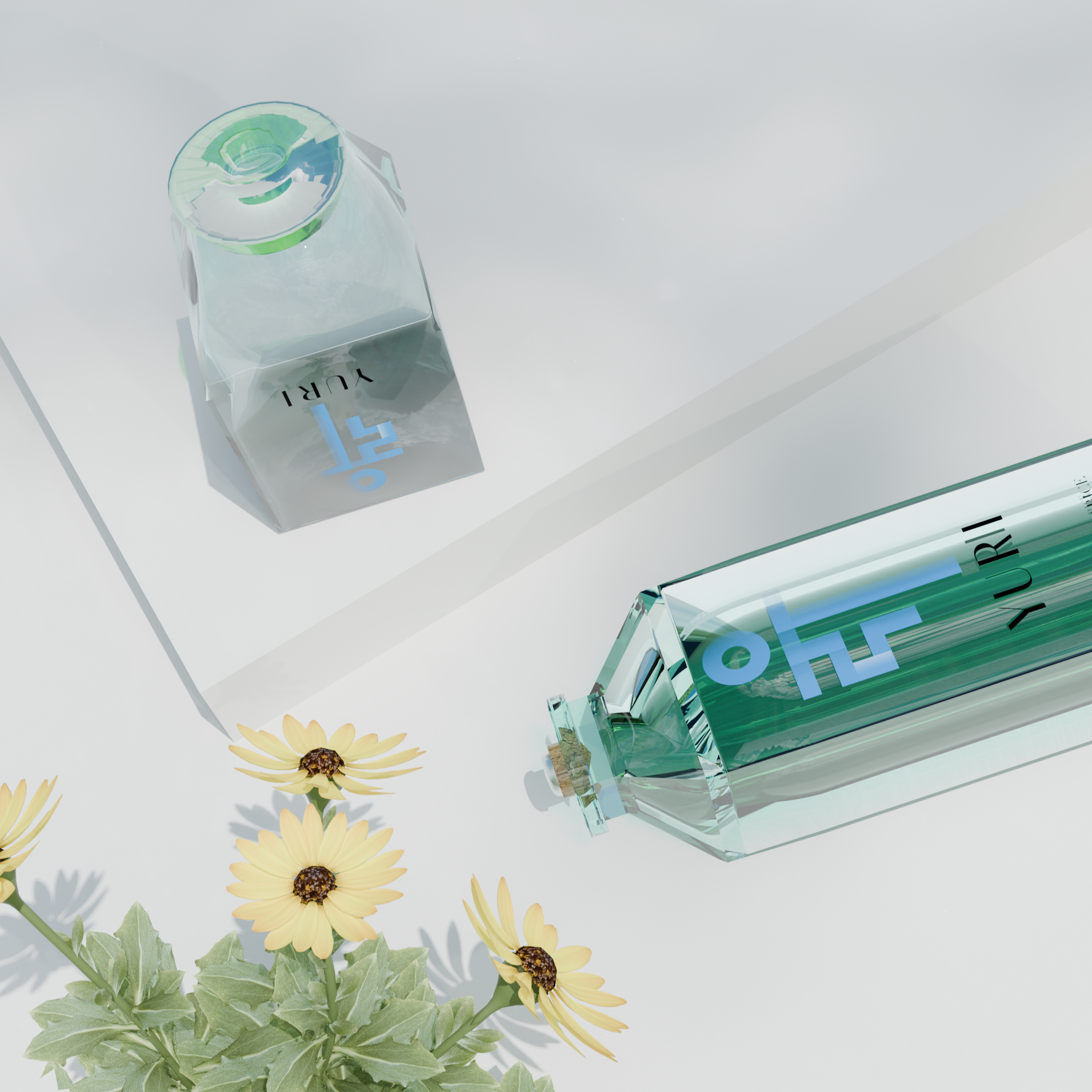
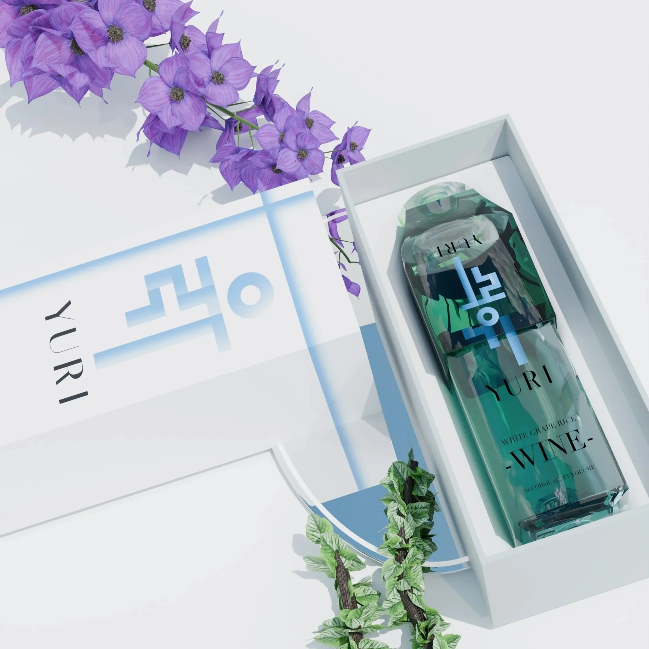
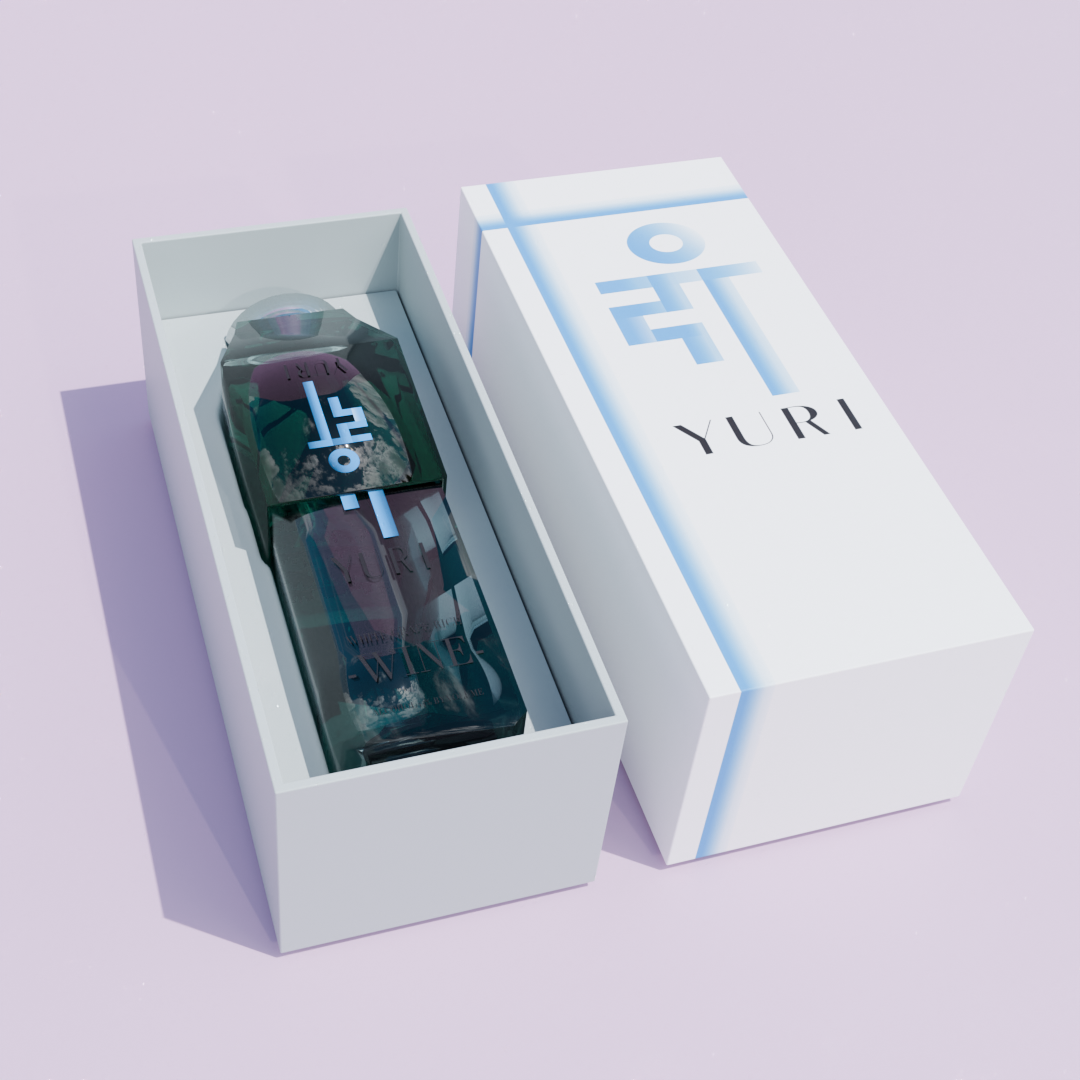
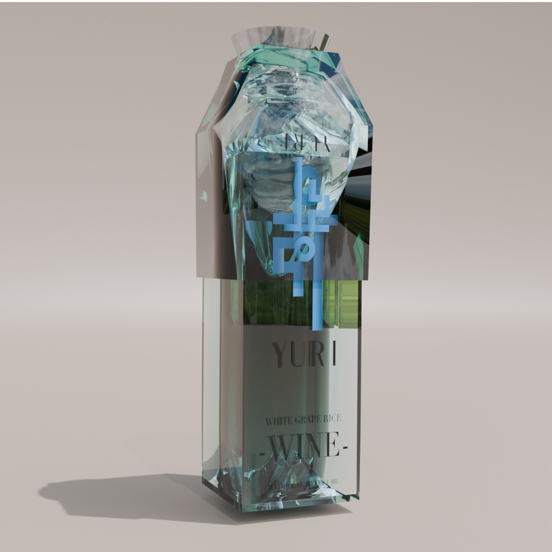
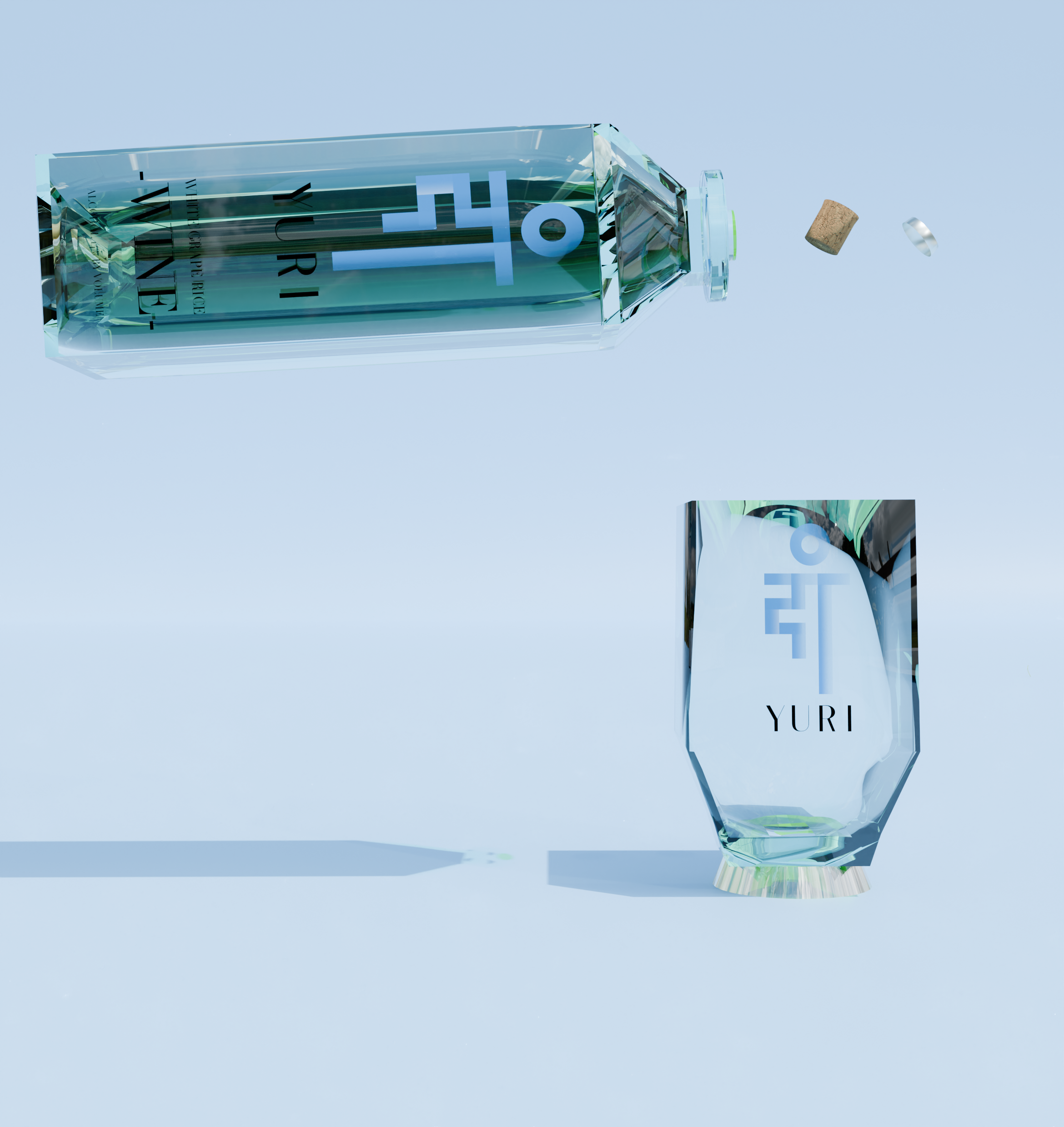
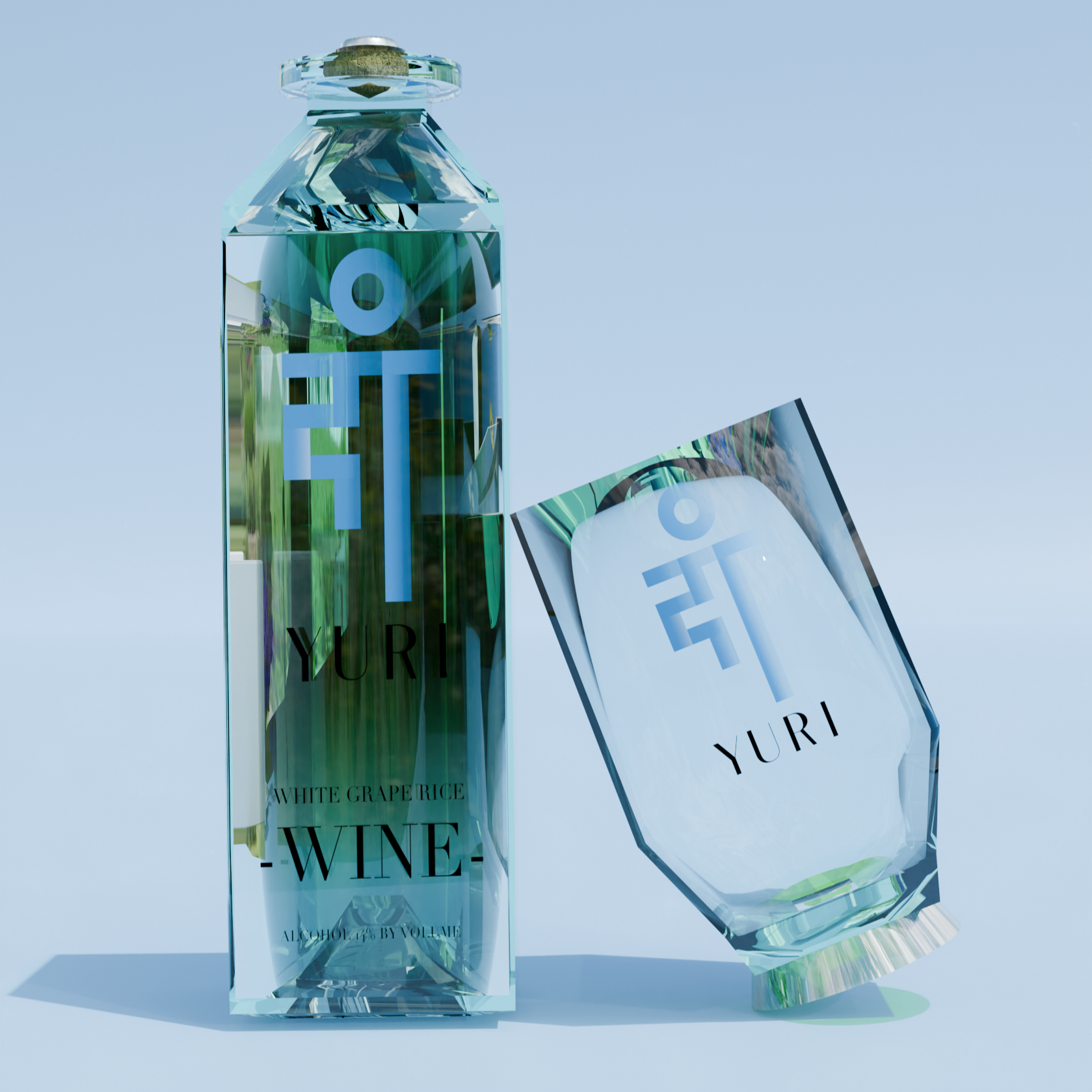
Yuri is a sophisticated product pairing that combines a wine bottle and glass cup into one cohesive product making it convenient for consumers. The wine is made with grapes and fermented rice sourced from Korea combining a Western take on Korean traditional wine. The name Yuri, meaning “glass” in Korean, reflects the brand’s emphasis on sleekness and luxury. The visual identity draws inspiration from the refraction of glass, resulting in a delicate light blue brand color that embodies purity and class.
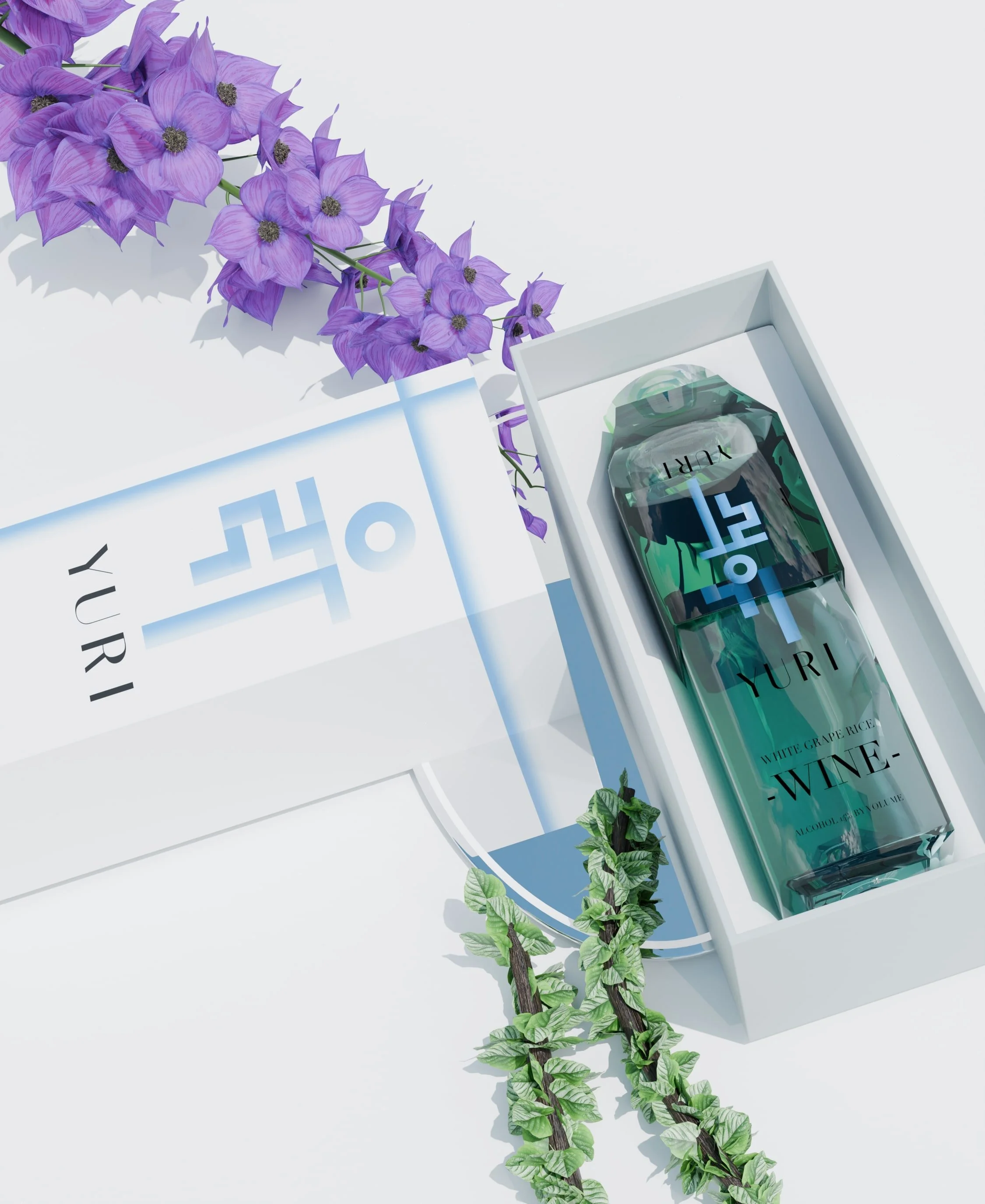
The product design was heavily influenced by the Korean characters in the logo. The logo incorporates Korean characters arranged to create a tall, rectangular composition, echoing the elongated silhouette of the bottle. The circular O element mirrors both the bottle’s lid and the base of the glass cup, establishing a unified visual relationship. Both the bottle and packaging were modeled in Blender, designed to clasp together for a precise, molded fit. The packaging features continuous line work that forms the shape of a ribbon that symbolizes a gift like presentation for the user.
Yuri’s target audience consists of professionals in their late 20s to mid-30s with established corporate careers. The product is envisioned for occasions such as fine dining experiences or leisure gatherings among friends. The accompanying ad campaign maintains the brand’s minimal and high-end sensibility. With minimal typography and simple layouts, the visuals allow the product’s brand to speak for themselves, which is conveying luxury through simplicity.
BRAINSTORMING
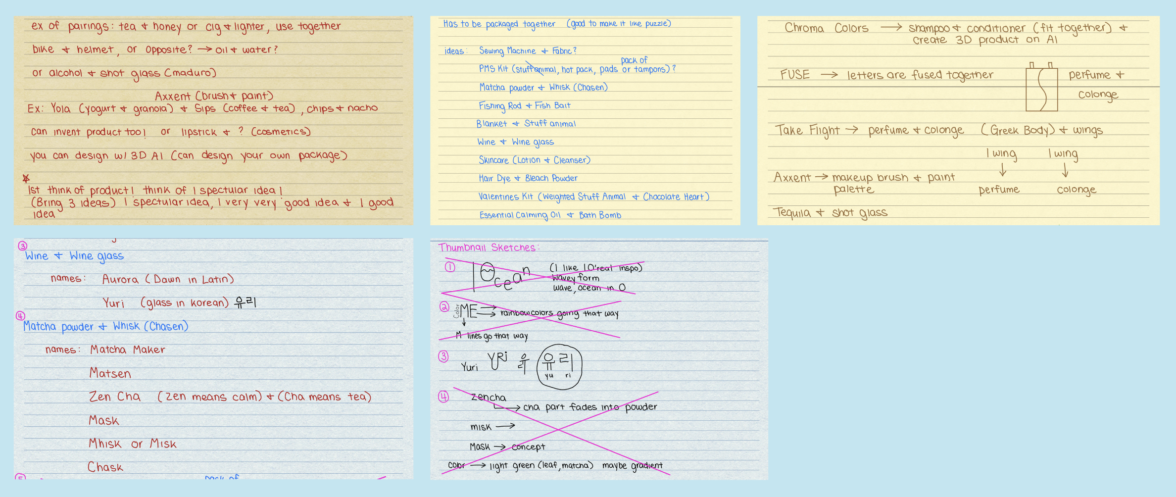
Because the project had to pair two products into one, I wrote out as many combinations along with brand name ideas. After choosing the final product pairing, I sketched out logos and the product designs/formats.
BLENDER
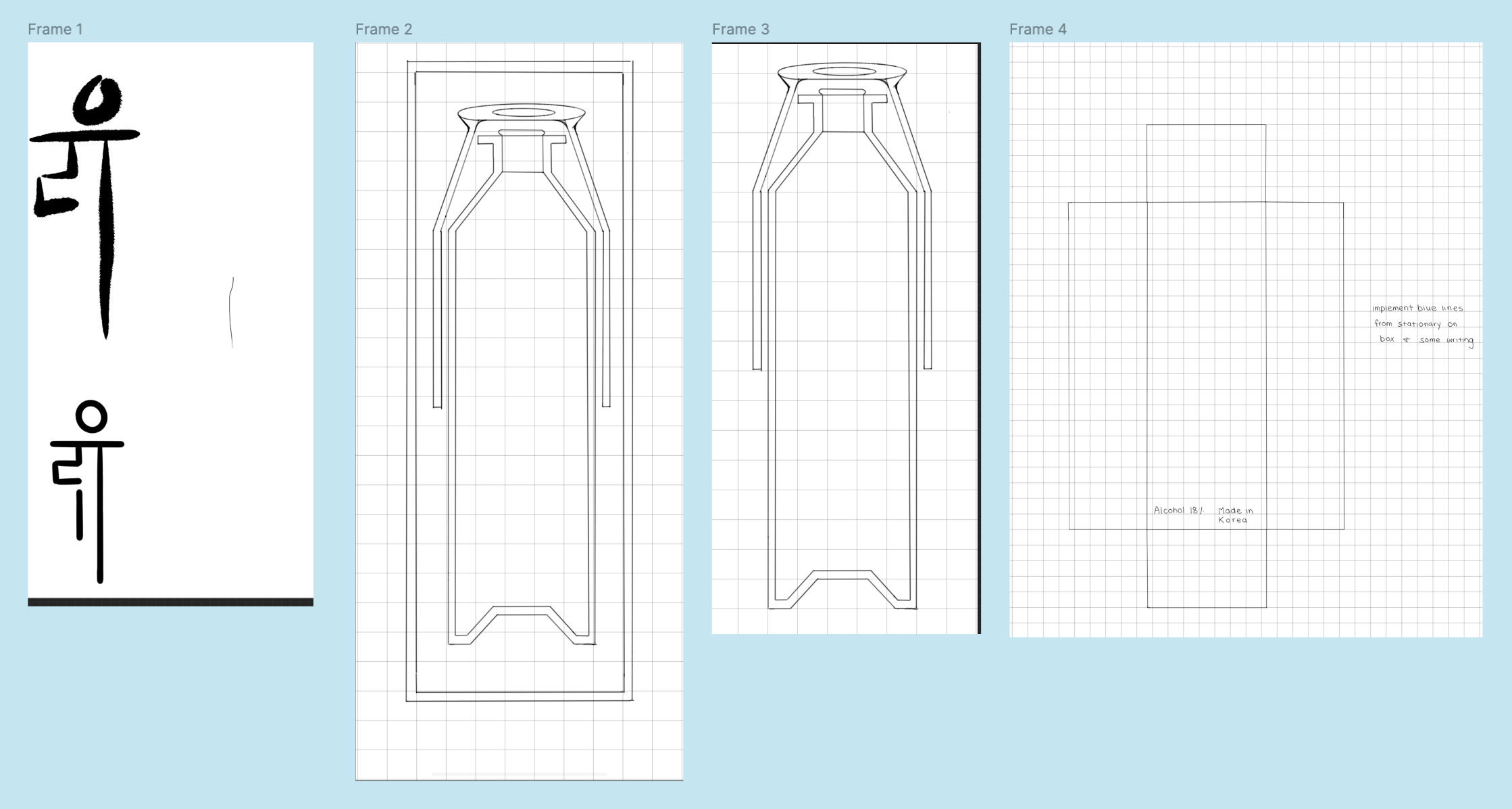
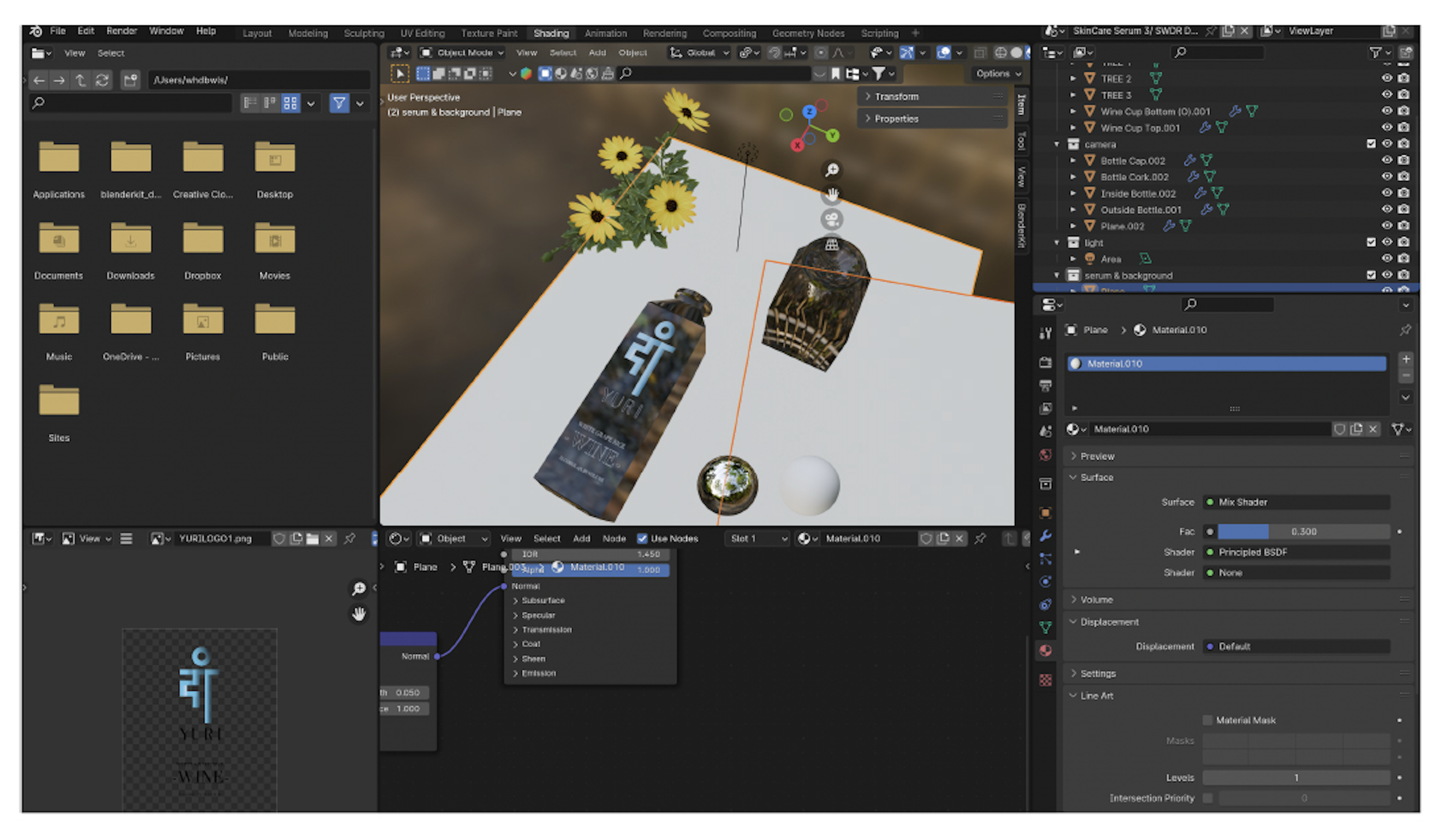
Because there were no mockups of the wine bottle shape I wanted specifically, I used Blender, which is a 3D software program used to create 3D models. In the image you can see me experimenting with adding the glass texture to the bottle and cup.
FINAL CAMPAIGN